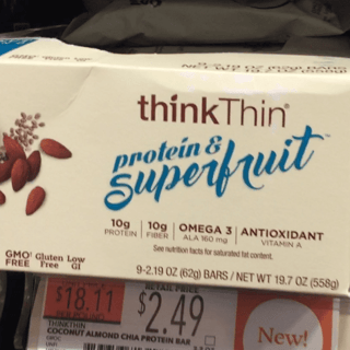
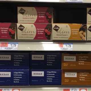
We try to get over to Whole Foods at least once a week, at least to say "hey" to some of our customers and scout out new trends and brands. While we're walking up and down the aisles, we always have a good banter as we react to the brands that catch our eye. This week, I thought: "Why not share those reactions with the Repsly community?"
So the next time I popped into Whole Foods, I recorded some of my off-the-cuff reactions to the packaging, placement, and messaging I saw on the snack shelf. Check out the video below!
Key Takeaways
Beware of Objectivity
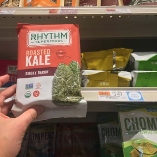
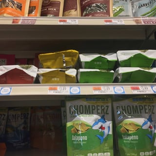
Your packaging may be objectively well-designed and thoughtful, but if it can’t sit up straight without stock behind it to hold it up, or shelving is blocking your unique flavor name, then it doesn’t matter how cool your typography is. The bottom of a bag is a place where ingredients, taglines or nutritional values often live, but a shelf may block the bottom 2+ inches of your packaging. Putting information there may be better than crowding the bag elsewhere, but just keep obstruction in mind.
Rhythm Superfoods, whose packaging by all other measures is smart and clean, fell victim to this (I still love their beet chips though). Always keep in mind how your product will literally sit on the shelf.
Don’t Get Lost in a Sea of the Same
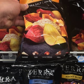
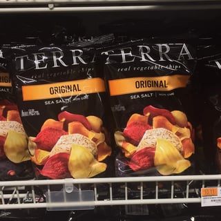
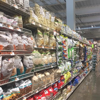
In the entire snack category, no matter how tasty your product is, differentiating yourself on the shelf could be the key to converting more customers. Your tactic could be color blocking, going for a less-utilized color, or straying from the category’s packaging norms.
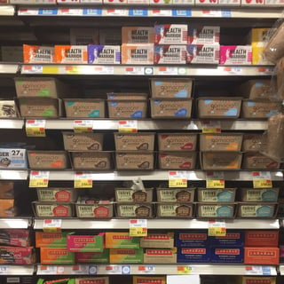
When it comes to bars, the box has to communicate all the same information as a big bag of popcorn but in a space the size of a Harry Potter book spine. The design of the box is just as, if not more important than, the individual package. That’s what draws a shopper in when they have dozens of options, a limited attention span, and kids or or other grocery shopping to get back to.
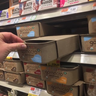
Are earth tones are central to your branding, but you know the color isn’t eye-catching? Take a hint from GoMacro and mix up the structural design of the package itself, not just the artistic design.
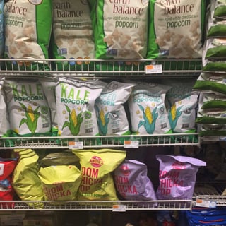
The color purple has no direct association with popcorn, but Angie’s BOOMCHICKAPOP went for it for their kettle corn anyway. Their bag stands out among the popular whites, neutral tones and reds of the popcorn category, even with just two facings. It also looks great sitting next to their yellow bag and the yellows of other brands, which is purple’s complementary color. They’re brilliantly taking advantage of their competitors' attributes.
Transparency. Transparency. Transparency.
In packaging, messaging, and product details. If I can see my food, even if it isn’t the most beautiful looking product, I am drawn to it. If your brand acknowledges that there is certain information I need to know about my food before I buy it, and you make that information readily available, I’m even more likely to buy your product.
You have ingredients and a brand story than aligns with my environmentally friendly values? Tell me. Your small bar packs 8g of protein into 200 calories? I want to know. According to the folks at Nielsen, 32 percent of Millennials are very willing to pay a premium for sustainably sourced ingredients and healthy products with packaging callouts tend to outperform the category as a whole.
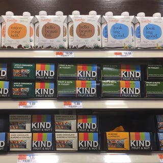
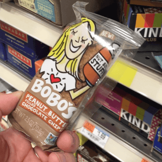
Take a hint from KIND, whose clear packaging shows of the whole nuts and drizzled chocolate on their bars. Or Bobo’s, whose oat bars may not be as aesthetically appealing, but their homemade, handmade feel is central to their story, so showing off their simple product makes sense. Also, shout-out to Svelte for telling me I’m beautiful. Back atcha.
Now What?
Don’t wait until your own mental road block happens to get into the field and refresh your perspective on what’s happening in the CPG space. Whether it’s casually scanning the aisle for a few extra minutes on a shopping trip in the evening, doing a more comprehensive competitor audit in the field, or adding a few extra questions to your rep’s field report forms, take steps to keep your mind and team sharp. Sharp mind, sharp thinking, sharp strategy.
If you’re in a competitive mood, and aren’t sick of my voice yet, check out my animated video on how to analyze your competitive landscape.
Not in Whole Foods yet and you’re thinking about taking that step? (First of all, HECK YEAH!) My buddy Molly made a nice little step-by-step guide to filling out the Whole Foods vendor application.
Ear to the grindstone. Get out there and carpe that diem.
Was this helpful? Want to see more videos from us like this? Tweet @Repsly or drop us a line in the comments below.
![3 Minutes in the Whole Foods Snack Aisle with a Millennial Shopper [Video]](https://391043.fs1.hubspotusercontent-na1.net/hub/391043/hubfs/Sarah%20Blog/whole%20foods%20aisle%20cover.jpg?width=770&height=404&name=whole%20foods%20aisle%20cover.jpg)
