 Just like any other separation, the process of rebranding can be difficult, but as a business evolves it is essential that its brand follows that progress. A brand change is warranted in obvious times such as when a business changes its name or it acquires another business, but here are some less obvious examples of when it may be time to move on from your current brand image.
1. Changing Scope of Services
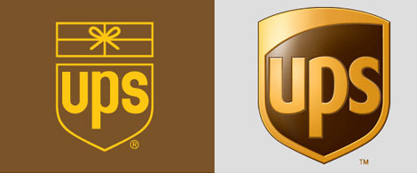
One crucial reason to rebrand is if the brand does not represent the full scope of services the business offers. For example, in 2003, UPS decided that their brand logo with the individual image of a package was limiting, as they provided a number of other services such freight and small business shipping. They wanted to get rid of the package image, yet keep the shield that promoted trust and dependability with customers. The rebrand put the shield alone on a white background to emphasize its meaning.

Image Source
2. New Target Audience
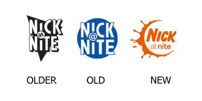
Another important time to consider a rebrand is when the target audience changes or expands. Take a look at Nick at Nite’s evolution of brand image as an example. The most recent rebranding was an attempt to bring together all the elements of their program: NickJr., Nick@Nite, Teen Nick and Nick Toons. To encompass all these audiences, the network created a logo with a childlike element of the splashed semi-circle while also producing a more mature message by changing the “@” symbol to the word “at.”

Image Source
3. Anniversaries
Aside from representing services of a business and encompassing the character of its audience, a brand should also reflect the legacy of the company. A subtle rebranding may be appropriate for major anniversaries or landmarks of the business. For example, when Starbucks passed their 40th anniversary in 2011, they centered their logo on the familiar mermaid image that they have carried throughout their time as a business. The most impactful change they made was the removal of “Starbucks Coffee,” signalling that in this new era of their business, their brand was so recognizable that the business name was not needed in the logo.


 Just like any other separation, the process of rebranding can be difficult, but as a business evolves it is essential that its brand follows that progress. A brand change is warranted in obvious times such as when a business changes its name or it acquires another business, but here are some less obvious examples of when it may be time to move on from your current brand image.

